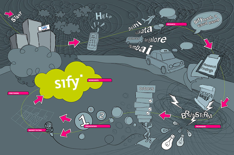
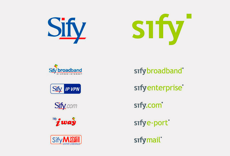
Sify was a pioneer in defining Internet services, infrastructure, processes and networking in India as well as setting standards along the way. In the late 90s, Sify was India’s first private ISP with a dial up service, making Sify a household name. Due to rapid inorganic growth, varied identities had cropped up for its many offerings. This diluted their identity and brand perception pushing them to reinvigorate their branding.
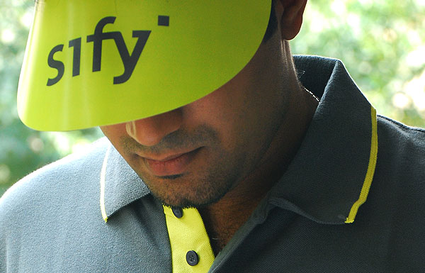
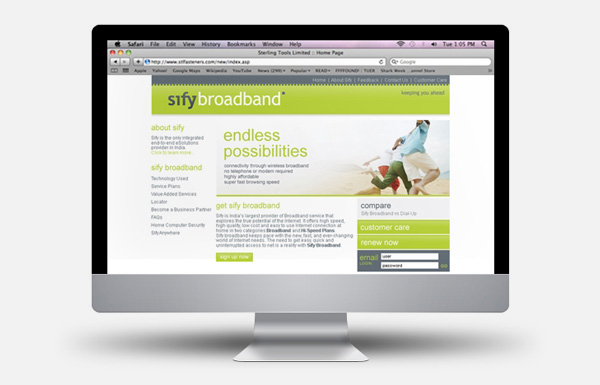
A brand audit was done to check if ‘Sify the identity’ matched ‘Sify the brand’. It was clear that the brand needed a refresh. The vision of Sify ‘to stay ahead’ was visualised in the logo – quite simply, the dot of the ‘I’ has moved ahead of the word. The tagline ‘keeping you ahead’ positioned the company as a leading service provider that was customer oriented.
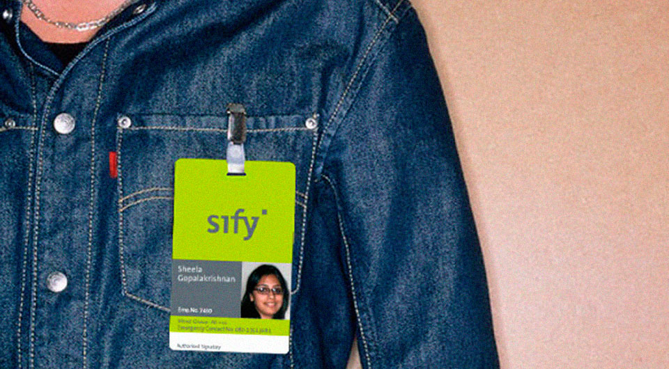
We simplified and standardized the complicated brand architecture. The color palette was a differentiator, infusing a sense of freshness into the identity.
![]()
Client: Sify Technologies
Firm: Lopez Design